Screens
Key Screens
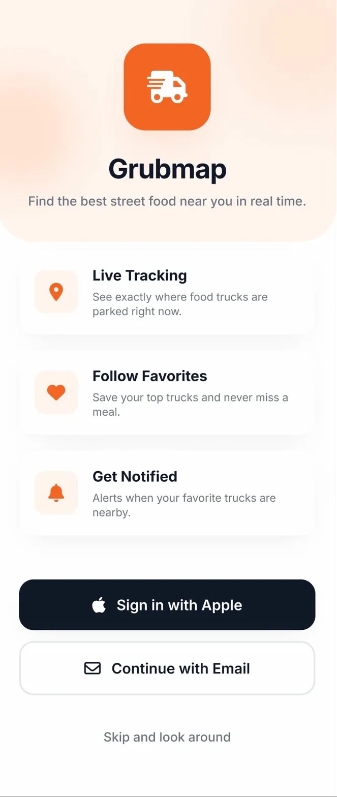
Home
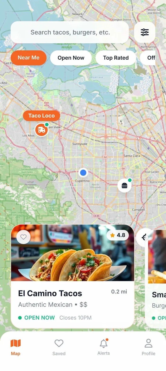
Map View
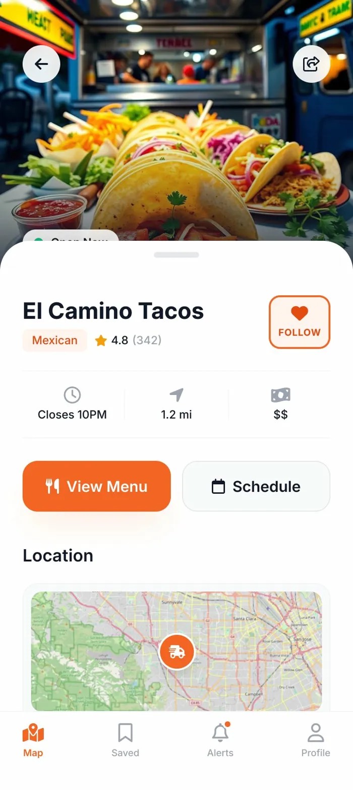
Truck Detail
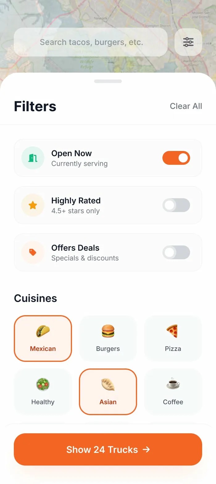
Filters
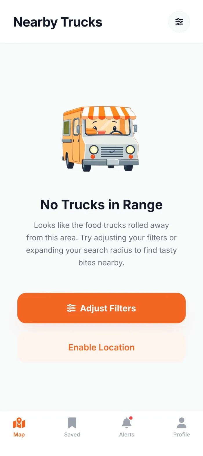
Empty State
Find the truck. Not the frustration. A hyperlocal food truck discovery app built from zero — research to shipped product.
Food trucks are one of the most beloved parts of urban food culture — but discovering them is a nightmare. Trucks move daily, post inconsistently across Instagram, Twitter, and Facebook, and cancel without notice. Hungry users waste lunch breaks chasing a truck that moved three blocks away. We needed to close the gap between a truck's real-time location and the person who wants to eat there — without making users do the work.
The 11-screen system covered all core flows — discovery, onboarding, saving, and scheduling — at a fidelity ready for direct engineering handoff. Contextual permission framing (Required vs. Recommended) was validated in usability testing as a meaningful trust signal, reducing hesitation at the location prompt. The schedule feature emerged as the primary differentiator in user testing: participants consistently cited week-ahead location data as the main reason they'd switch from existing alternatives.
Home
Map View
Truck Detail
Filters
Empty State