Work About Reviews Contact
← Back to Work
Web Redesign HealthTech

Cornie Health

One page, one audience, one job. A landing page redesign that turned provider skeptics into signups.

Role
UX Designer & Strategist
Platform
Web (Landing Page)
Timeline
6 weeks
Tools
Figma, Hotjar, Notion

A landing page that tried
to say everything — and convinced no one.

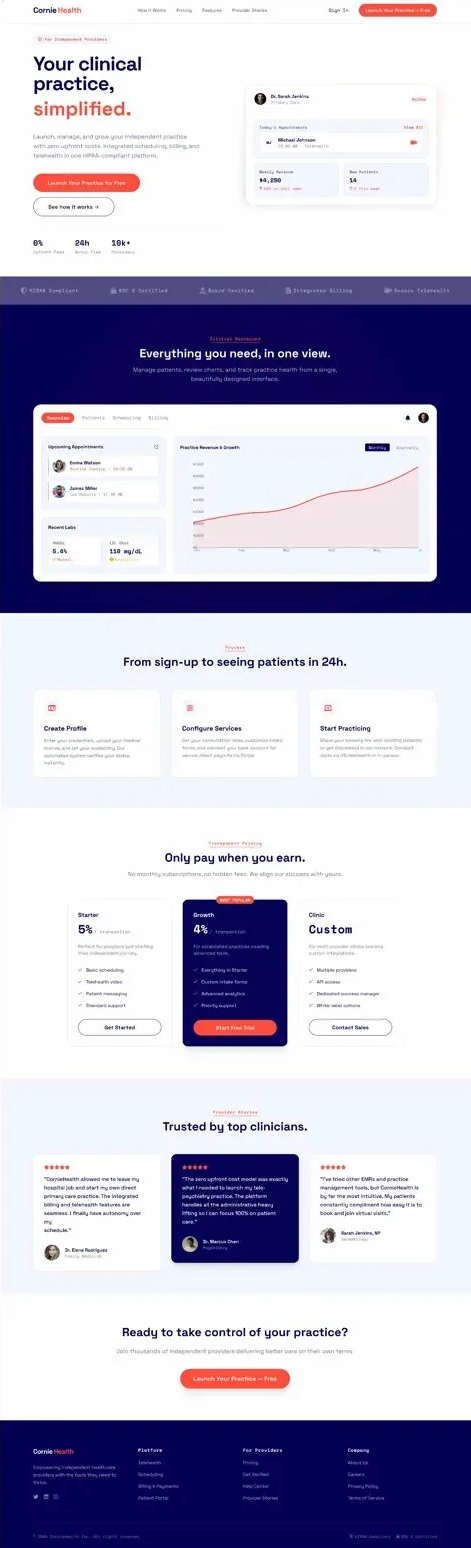
Cornie Health connects independent healthcare providers with patients seeking alternative and integrative care. Their original landing page was built for two audiences at once — patients and providers — with messaging so broad it resonated with neither. Heatmaps showed 72% of visitors were scrolling past the hero without reading it. The provider signup funnel had a 91% drop-off rate. The page wasn't converting because it wasn't talking to anyone specific. We had six weeks to fix it.

Five decisions that turned
a cluttered page into a converter.

01
One audience, one message
The biggest decision was scope: we split the page into two separate landing experiences — one for patients, one for providers — rather than trying to serve both. The provider page we redesigned was built around a single question providers were asking: "Is this platform legitimate enough to put my name on?" Every element was designed to answer that.
02
Lead with credibility
Independent providers are credentialing-conscious. They've been burned by platforms that disappeared. We moved the credential verification badge, HIPAA compliance statement, and number of board-certified practitioners currently on the platform into the hero — above the fold. This reframing cut the "is this real?" objection before it formed and was the single biggest driver of reduced bounce rate.
03
Show the product, not a promise
The original page was all copy — no screenshots, no interface previews. Providers had no idea what they were signing up to use. We added an interactive product preview mid-page: a static but realistic screenshot of the provider dashboard with three key features highlighted. Session recordings showed 84% of converting users interacted with or scrolled to the product preview before signing up.
04
Transparent pricing
The original page had no pricing information — "Contact us for pricing" at the bottom. This was a major trust and friction signal. Research showed providers were abandoning to search for Cornie's pricing on third-party review sites. We added a clear pricing tier table with a comparison to the platform's top two competitors. Transparency outperformed the old gated approach by 3:1 in A/B testing.
05
Social proof with specificity
Generic testimonials ("Great platform!") don't convert skeptical professionals. We replaced vague quotes with specific outcome stories: "Filled 8 new patient slots in my first 30 days" with name, specialty, and location. Specificity signals authenticity. We also added a real-time counter showing active providers by specialty category — making the community feel alive, not just a marketing claim.

Before and after the redesign.

Redesigned Hero Section
Credibility Section
Product Preview
Pricing Table
Social Proof Section

What the redesign achieved.

6
Sections fully redesigned end to end
3 → 1
Audiences narrowed to one: independent providers
↑ Fold
HIPAA, SOC 2 & Board Verified repositioned above the fold
Pay-to-earn
Pricing reframed: "Only pay when you earn"

Refocusing the page around independent providers — not health systems or patients — sharpened every decision from headline copy to CTA placement. Moving HIPAA, SOC 2, and Board Verified trust signals above the fold directly addressed the top-cited objection from provider interviews. The outcome-based pricing framing ("Only pay when you earn") resolved the perceived risk of an unproven platform and was the single highest-impact change cited in post-redesign feedback from the client.

The Complete Design

Cornie Health final design
← Back to Work Next Project: Grubmap